How to change image size in HTML

We often add images to our web pages to make them look more interactive and to keep visitors engaged. But many times images don’t come in the wanted change image size in HTML.
So, we have some solutions about how to deal with images. And use it as our need.
3 ways to resize images
Within HTML
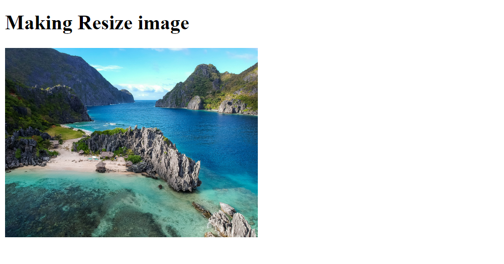
HTML gives two parameters in <img> tag “width” and “height”. Which we can use to change the size of images.
<html>
<body>
    <div class="container">
        <h1>Making Resize image</h1>
        <img src="./img/beach.jpg"
            width="400" height="300"
            alt="aerial view of beach">
    </div>
</body>
</html>
Code language: HTML, XML (xml)
For this demo, we are gonna use this image from Unsplash.
- In this code, We created a <h1> and <img> inside a <div> with class “container”.
- Then in <img> tag we gave a width of “400px” and height of “300px”
- The original size of the image is 3968 x 2976 but with the help of <img> tag parameter. We successfully resized it to 400 x 300 dimensions.

With CSS
We can get the same result using CSS too But for CSS to work we have to remove the parameters of “width” and “height”.
We are using this image from Unsplash.
<body>
  <div class='container'>
  <img src="https://images.unsplash.com/photo-1635373670332-43ea883bb081?ixlib=rb-1.2.1&ixid=MnwxMjA3fDB8MHxwaG90by1wYWdlfHx8fGVufDB8fHx8&auto=format&fit=crop&w=1881&q=80" alt="astronaut in orange suit">
  </div>
</body>
Code language: HTML, XML (xml)
*,
*::before,
*::after {
margin: 0;
padding: 0;
box-sizing: border-box;
}
body{
height: 100vh;
background-color: #240046;
}
.container img{
width: 380px;
height: 550px;
}
.container {
height: 100%;
display: flex;
align-items: center;
justify-content: center;
}
Code language: CSS (css)Now in HTML Code
- We created a <div> with class “container”.
- Within this <div> we inserted an image using <img> tag.
In CSS,
- Firstly, we removed all styling that comes from browsers.
- Then we gave a background color to the body
- Then we targeted image in the <div> by
using “.container img { … }”. - Now here we gave a width of “380px” and height of “550px”.
- After that centered the image using the Flex Box method.
You can find the complete Code Pen here
Disadvantages of both methods
Sometimes we are restricted by a specific dimension. Depending on the original size of image sometimes it can shrink or expand too much.
For example, if I increase the width of previous code from “380px” to “500px”. It will look something like this.

So solve this issue we have a solution using CSS.
Object Fit Property
Using this property we can fix the problem of stretching and shrinking an image.
.container img{
  width: 500px;
  height: 550px;
  object-fit: cover;
  border: 1px solid white;
}
Code language: CSS (css)
We applied “object-fit” property. It takes inputs like cover, contain, none, and fill.
- cover – Cover crops the images and keep the focus in the center of the image
- contain- it maintains the dimension of image within the given width and height. If “width” and “height” will be bigger than the image. Then there will be space around the image.
- none – Using this will be no effect on the image.
- fill – This property will stretch or shrink the image to match the given dimension of an image.
After using “cover” with “object-fit”, we will get this

Now let’s say after using these properties resulted in image focuses on the center part of the image. And you want to keep other parts of an image in focus.
For that, we have another CSS Property which is object-position,
object-position takes parameters according to a position like –
“top”, “left”, “right”, “bottom” and “top left”, “top right”, “bottom right” , “bottom left”.
And Apart from these, we can also give parameters in percentages and pixels. To learn more in-depth, you can read this article on CSS Tricks.
.container img{
  width: 500px;
  height: 550px;
  object-fit: cover;
  object-position: top;
  border: 1px solid white;
}Code language: CSS (css)
In this code, we implemented object-position with the value of “top”. And we got this result with top part of the image in focus.

You can check the complete code pen here.
Conclusion
- We can change image size in HTML with two parameters “width” and “height”.
- We can give “width” and “height” through CSS too
but after removing “width” and “height” parameters from HTML. - Sometimes, the dimension of the image is fixed and the image
can look expanded or shrunk according to dimension.
To fix this we use the object-fit property. - To focus on other parts of an image except for center part we can use the object-position property.
Sharing is caring
Did you like what Sunny Shah wrote? Thank them for their work by sharing it on social media.
No comments so far
Curious about this topic? Continue your journey with these coding courses: