Horizontal Alignment in CSS – How to Align Elements in CSS

Have you ever struggled with alignment with some text or center a div? Certainly, you did. We have all experienced it at least once. Undoubtedly, aligning objects in CSS is the most frustrating task. Things might quickly become chaotic.
HTML and CSS are the first things we learn when we start Web Development. Although CSS isn’t rocket science, it can get confusing if you don’t know what you’re doing. Specifically in terms of alignment and positioning.
We can align elements using CSS in a variety of ways. One can quickly become confused if one uses them without understanding how a particular alignment technique works. Even if we know the fundamentals, having so many options can sometimes overwhelm us, and we don’t know which one to choose.
This article will discuss various possible ways to align/center multiple elements using CSS. We will also look at some popular layout systems such as flex-box and grid. We’ll also talk about which one might be best for you.
What type of alignments are there in CSS?
In CSS, we either align elements horizontally or vertically, or both. Let’s quickly go through both of these.
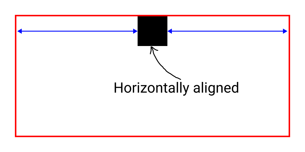
What is horizontal alignment?

It means to place or arrange elements in a particular fashion along the horizontal axis.
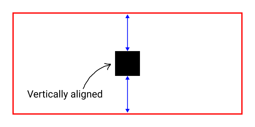
What is vertical alignment?

It means to place or arrange elements in a particular fashion along the vertical axis.
Aligning text horizontally: text-align
To align any text using CSS, we will use the text-align property. We can give the following values to the text-align property,
text-align: left;
text-align: right;
text-align: center;
text-align: start;
text-align: end;
text-align: justify;
text-align: inherit;
text-align: initial;Code language: CSS (css)
Let us use the text-align property and align the text,
<div>
    <p class='left'>Left aligned</p>
    <p class='center'>Center aligned</p>
    <p class='right'>Right aligned</p>
</div>Code language: HTML, XML (xml)
p {
border: 1px solid red;
}
.left {
text-align: left
}
.center {
text-align: center;
}
.right {
text-align: right;
}Code language: CSS (css)We’ll observe that the text gets horizontally aligned to the left, center, and right in each of the 3 paragraph tags.

text-alignCenter aligning a div horizontally: margin: auto
To align a div, we can use the margin property. If we set margin: auto, we get equal margins on both left and right sides, which eventually centers the element horizontally.
Let us now test this out,
<div class='wrapper'>
    <div class="box div1">center</div>
</div>Code language: HTML, XML (xml)
.wrapper {
width: 100%;
height: 100px;
border: 1px solid red;
}
.box {
width: 50px;
height: 50px;
background: red;
}
.div1 {
margin: auto;
}Code language: CSS (css)The child div will be centered horizontally and not vertically. margin: auto will not affect the vertical alignment.

div using margin: autoAligning a div horizontally: float
We can use the float property to align a div horizontally to either left or right. You can set the following alignments using the float property,
float: left;
float: right;
float: none;
float: unset;
float: initial;
float: inherit;
float: inline-start;
float: inline-end;Code language: CSS (css)
Let us now try to align a few div to the left and right,
<div class='wrapper'>
    <div class="box div2">left</div>
    <div class="box div3">right</div>
</div>Code language: HTML, XML (xml)
.div2 {
float: left;
}
.div3 {
float: right;
}Code language: CSS (css)
div using floatWe can see that both the div elements are on the same line; this happens because float makes the element’s position absolute to the parent element.
NOTE: The float property is not recommended to align stuff to the left or right. We will see more valuable properties further.
Aligning a div horizontally: position: absolute
We can use the position property to position a div horizontally to either left, right, or center. For this, we will use absolute the positioning.
Let’s jump onto the code,
<div class="wrapper relative">
    <div class="box div4">left</div>
    <div class="box div5">center</div>
    <div class="box div6">right</div>
</div>Code language: HTML, XML (xml)
.relative {
position: relative;
}
.div4 {
position: absolute;
left: 0;
}
.div5 {
position: absolute;
left: 50%;
transform: translateX(-50%);
}
.div6 {
position: absolute;
right: 0;
}Code language: CSS (css)All 3 div elements get aligned to the left, center, and right. The div elements are on the same line because of absolute positioning.

div using position: absoluteAligning a div horizontally: grid
We can use the grid layout to position a div horizontally to either left, right, or center. We can also arrange all the elements inside the grid container in various fashions.
Let’s use the CSS grid layout to align a few div elements to the left, right, and center.
<div class="wrapper grid">
    <div class="box div7">left</div>
    <div class="box div8">center</div>
    <div class="box div9">right</div>
</div>Code language: HTML, XML (xml)
.grid {
display: grid;
}
.div7 {
justify-self: start;
}
.div8 {
justify-self: center;
}
.div9 {
justify-self: end;
}Code language: CSS (css)The 3 div elements will be aligned to the left, center, and right. Since there are not absolute positioned, they are placed in their respective rows.

div using grid layoutAligning a div horizontally: flex-box
The flexbox layout system has made designing responsive layouts much simpler than it used to be. It simplifies aligning and positioning elements to a great extent. Mostly, all the modern user interfaces are created using the flex-box layout system.
Using flex-box, we can align our div elements very easily. Not just this, we can create complex structures very easily using the flex-box layout system.
By default, the flex-box places all the elements inside a parent container in a single row. We can change the placement of these elements to a column using the flex-direction property. It is possible to arrange elements in various positions relative to each other. We can also change a specific element’s alignment.
Let us align a few div elements horizontally to the left, right, and center.
<div class="wrapper flex-column">
    <div class="box div10">left</div>
    <div class="box div11">center</div>
    <div class="box div12">right</div>
</div>Code language: HTML, XML (xml)
.flex-column {
display: flex;
flex-direction: column;
}
.div10 {
align-self: start;
}
.div11 {
align-self: center;
}
.div12 {
align-self: end;
}Code language: CSS (css)All the 3 div elements are aligned to the left, center, and right. Here also, the elements are not absolute positioned. Hence, they are in their respective rows. The result here is similar to what we got with the grid layout.

div using flex-box layoutArranging div horizontally in a flex-box container
As previously discussed, we can use the flex-box layout to create various horizontal arrangements. To achieve this, we will see the justify-content property. Using this, we will arrange the child elements of the parent flex-box container relative to each other.
The justify-content property can take the following values,
justify-content: flex-start;
justify-content: flex-end;
justify-content: center;
justify-content: space-between;
justify-content: space-around;
justify-content: space-evenly;
justify-content: initial;
justify-content: inherit;Code language: CSS (css)
We apply the justify-content property on the parent container using the flex-box layout.
.container {
	display: flex;
	justify-content: center;
}Code language: CSS (css)
Consider the following layout.
<div class="wrapper flex-row">
    <div class="box div13">left</div>
    <div class="box div14">center</div>
    <div class="box div15">right</div>
</div>Code language: HTML, XML (xml)
.flex-row {
display: flex;
}Code language: CSS (css)
flex-box arrangementLet us now see what justify-content does when applied to the parent element for different values.
flex-start
.flex-row {
    display: flex;
    justify-content: flex-start;
}Code language: CSS (css)
The justify-content: flex-start; will not change the arrangement because the elements are already at the start of the parent container.

justify-content: flex-startflex-end
.flex-row {
    display: flex;
    justify-content: flex-end;
}Code language: CSS (css)
Using justify-content: flex-end, the child div elements will move to the end of the container in the horizontal direction.

justify-content: flex-endcenter
.flex-row {
    display: flex;
    justify-content: center;
}Code language: CSS (css)
Using justify-content: center, the child div elements will move to the center of the container in the horizontal direction.

justify-content: centerspace-between
.flex-row {
    display: flex;
    justify-content: space-between;
}Code language: CSS (css)
Using justify-content:space-between, the child div elements will get arranged in such a way that there is a uniform spacing between them.

justify-content: space-betweenNOTE: There will be no spacing between the elements and the walls of the container. The uniform spacing is only between the elements.
space-around
.flex-row {
    display: flex;
    justify-content: space-around;
}Code language: CSS (css)
Using justify-content:space-around, the child div elements will get arranged in such a way that there is a uniform spacing between them. A half-size space also separates elements and container walls.

justify-content: space-aroundspace-evenly
.flex-row {
    display: flex;
    justify-content: space-evenly;
}Code language: CSS (css)
Using justify-content:space-evenly, the child div elements will get arranged in such a way that there is a uniform spacing between them. There is even spacing between the elements and container walls.

justify-content: space-evenlyWhich one should you use?
Phew! There were just too many different methods. Here we only discussed some of the most widely used techniques, but there may be more ways to achieve similar results.
But, which one should we prefer?
The most preferred way will depend on the situation. But still, flex-box should be preferred whenever possible. It is capable of creating layouts that are both basic and complex. Some cool things about the flex-box layout system are,
- It supports all major browsers.
- Easy to use.
- Center elements beautifully.
- Make complex layouts without using complex CSS.
Conclusion
This article explored how we can use CSS to align and arrange HTML elements. We also discussed the flex-box layout system, which is also considered one of the most popular. Additionally, we examined various horizontal arrangements that we can make with the flex-box layout system.
You can access all the source code using the following link: https://codedamn.com/playground/E7cpq_BTThCj1WuJP3cdw
Thank you so much for reading ?
Sharing is caring
Did you like what Varun Tiwari wrote? Thank them for their work by sharing it on social media.
No comments so far
Curious about this topic? Continue your journey with these coding courses: